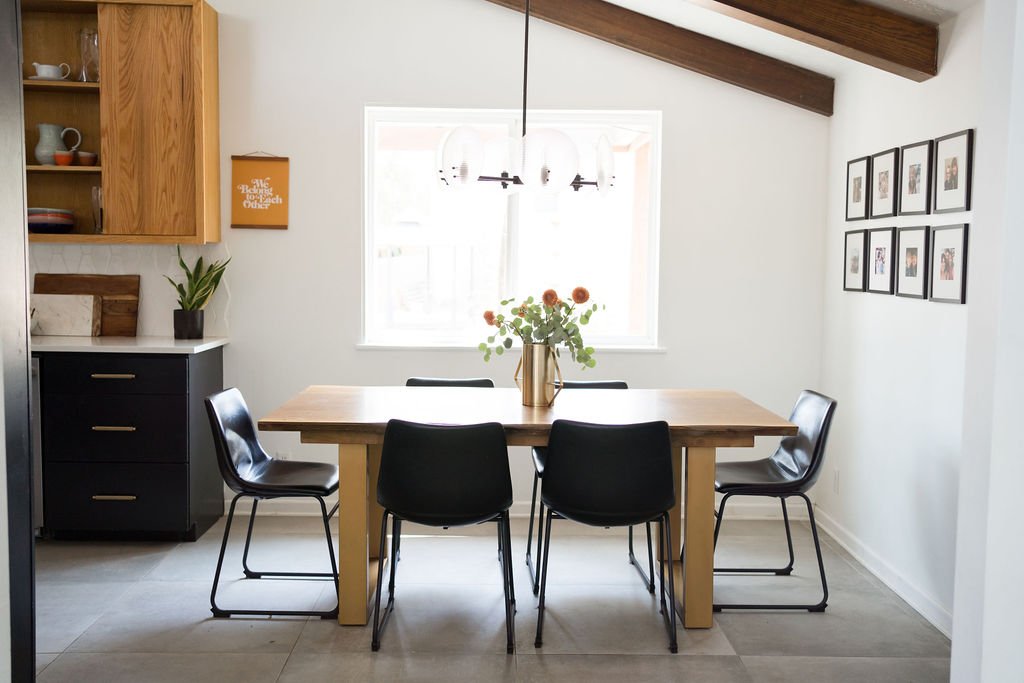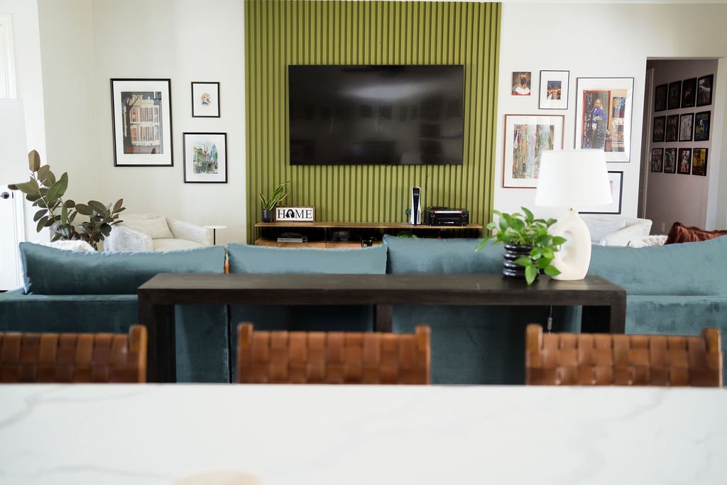
While my brother and I are in different fields, I think we’re in the same business. We’re both in the business of creating safe spaces.
Jeremy runs a counseling center called Oakwood Roots in Brazos County, Texas , and he creates space for stories to be held. For people to sit and be seen. In a town where if you’re not a white, heterosexual, upper middle class, evangelical 19 year old, you might be in the margins. Jeremy sat with clients in this town for years and heard stories again and again who had need for a safe space. A space to question faith, sexuality, humanity. Jeremy created Oakwood Roots to create a space of safety for all.
At Cultivate Your Space, we also exist to create spaces of safety. Physical areas where people can be undone. Come home and unwind. A space that invites respite and recovery. I’m marked by the number of clients that we’ve worked with that grew up in an unsafe home. We serve clients that are in need of healing in all areas of their lives and curating their home is just another avenue of working towards their overall health. It is the highest honor of my work.
So last fall, our businesses joined and we curated a safe and beautiful space for people to heal.
Here’s a sneak peak before we jump into what it took to make each office a safe space externally so that people are able to heal internally:
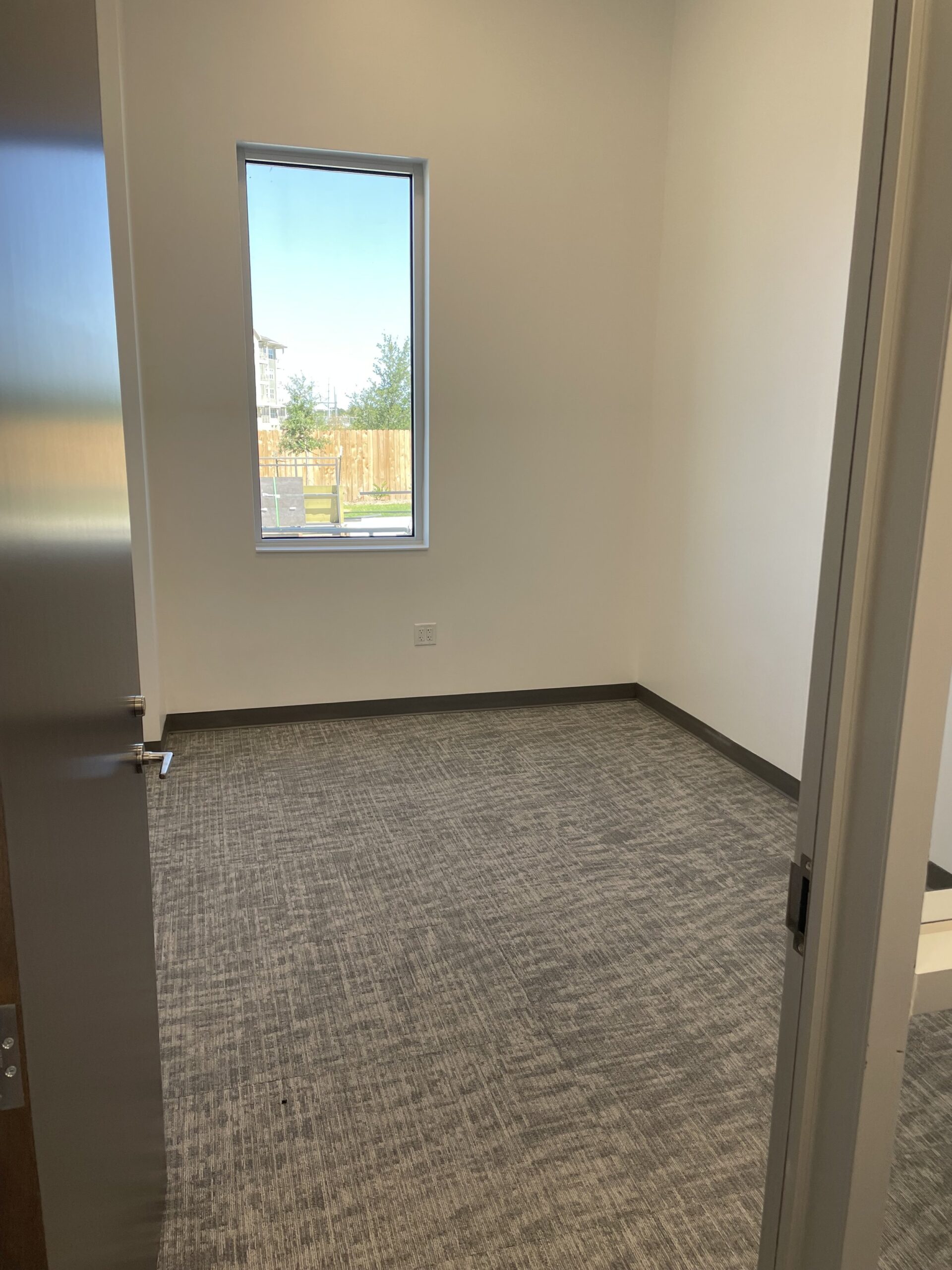
The Before
There was lots of natural light in the space before we started and there were a few pieces of furniture & artwork that we transitioned into the new space.
In total we transformed two new offices, seven furnished offices for a refresh and two waiting spaces.
The Process
Before I start any project I ask my clients to share a Pinterest board of styles, designs and pieces they like. It’s a great starting place for me to get a feel for design preferences.
After I’ve carried out some initial research, the kick-off call is where we get into the nitty gritty of how my client wants the space to look and feel. For Oakwood Roots is was essential that the space feel welcoming and safe, and here are a few of the ideas we started with:
-
Creating mobile storage for child-friendly spaces
-
Curating individual therapy offices that feel safe, warm, yet simple for clinicians to welcome clients
-
Maximizing the natural light so we could bring in more live plants
The Designs
Some of the furniture was brought from the previous office. The old office was slightly smaller and a little less modern. Thankfully a lot of the larger pieces still worked, but we needed to fill in a few gaps.
All of my designs I create for clients (virtually and in person) are clickable vision boards. The client receives a PDF where each item on the board takes them to a direct link to purchase the item. This way clients can purchase items over time or all at once!
Check out a few of the vision boards for Oakwood Roots below!
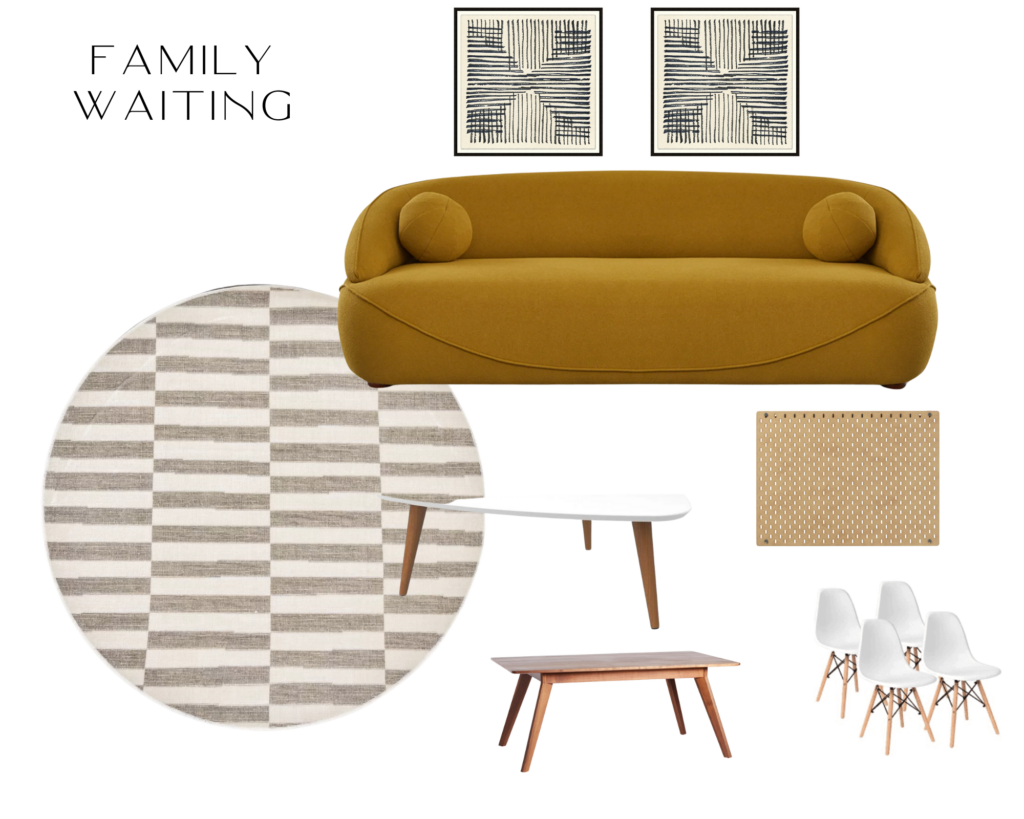
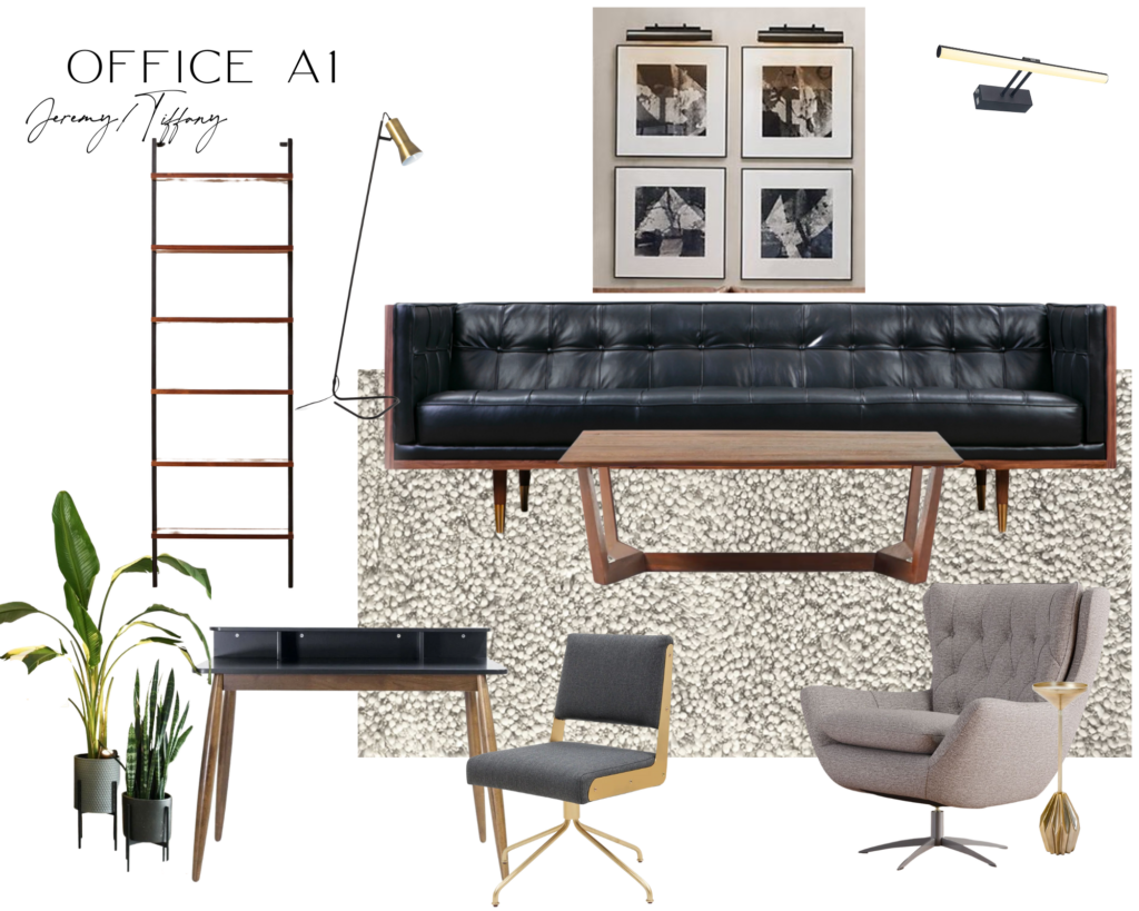

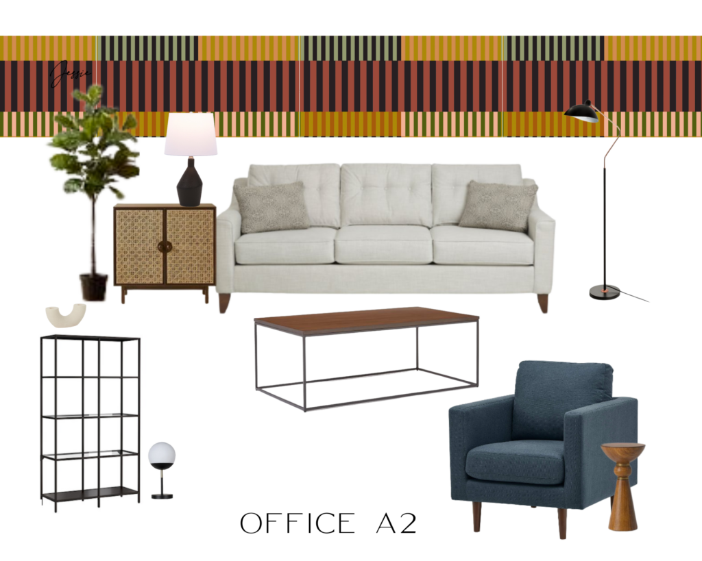


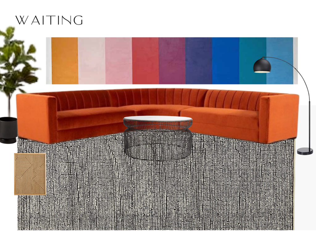
The building is a lease so we did not have the ability to paint the walls. Bright fun and color is a staple to the brand of the practice, so I had to get creative with how to bring in some fun.
In order to stretch the budget I decided to use peel and stick wallpaper in a creative way that didn’t require wallpapering an entire room or an entire wall.
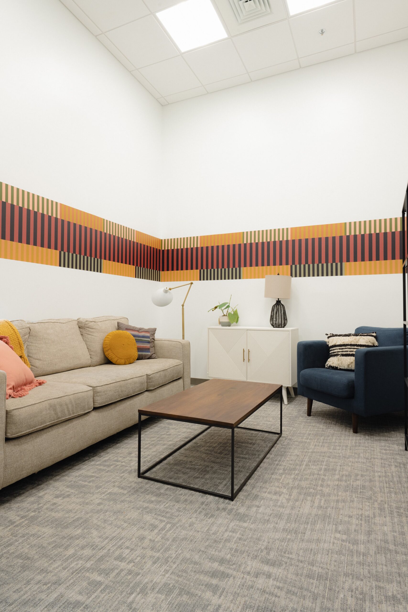
I also found some stripe “borders” to use in a few offices to bring in a few color blocks.
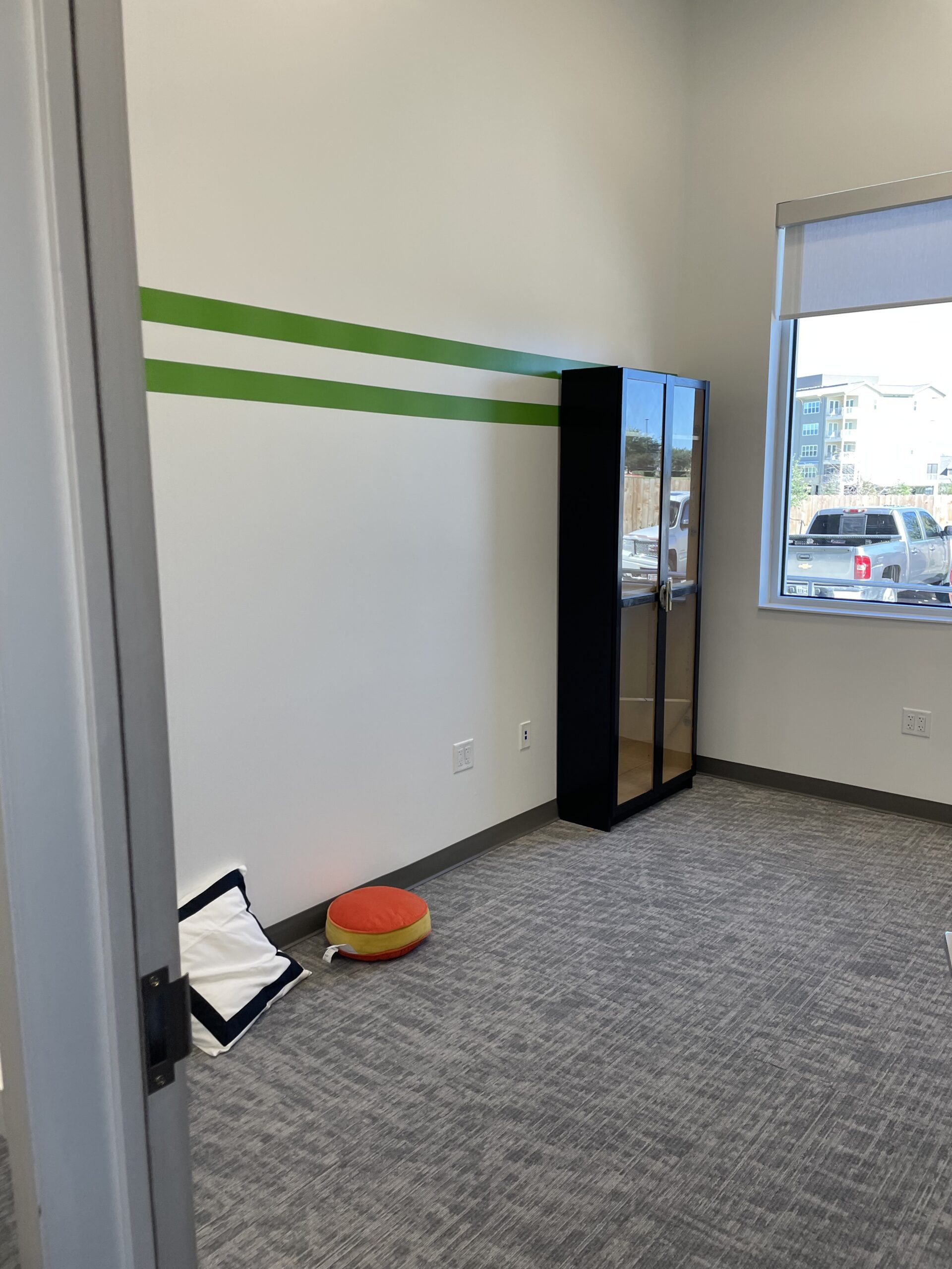
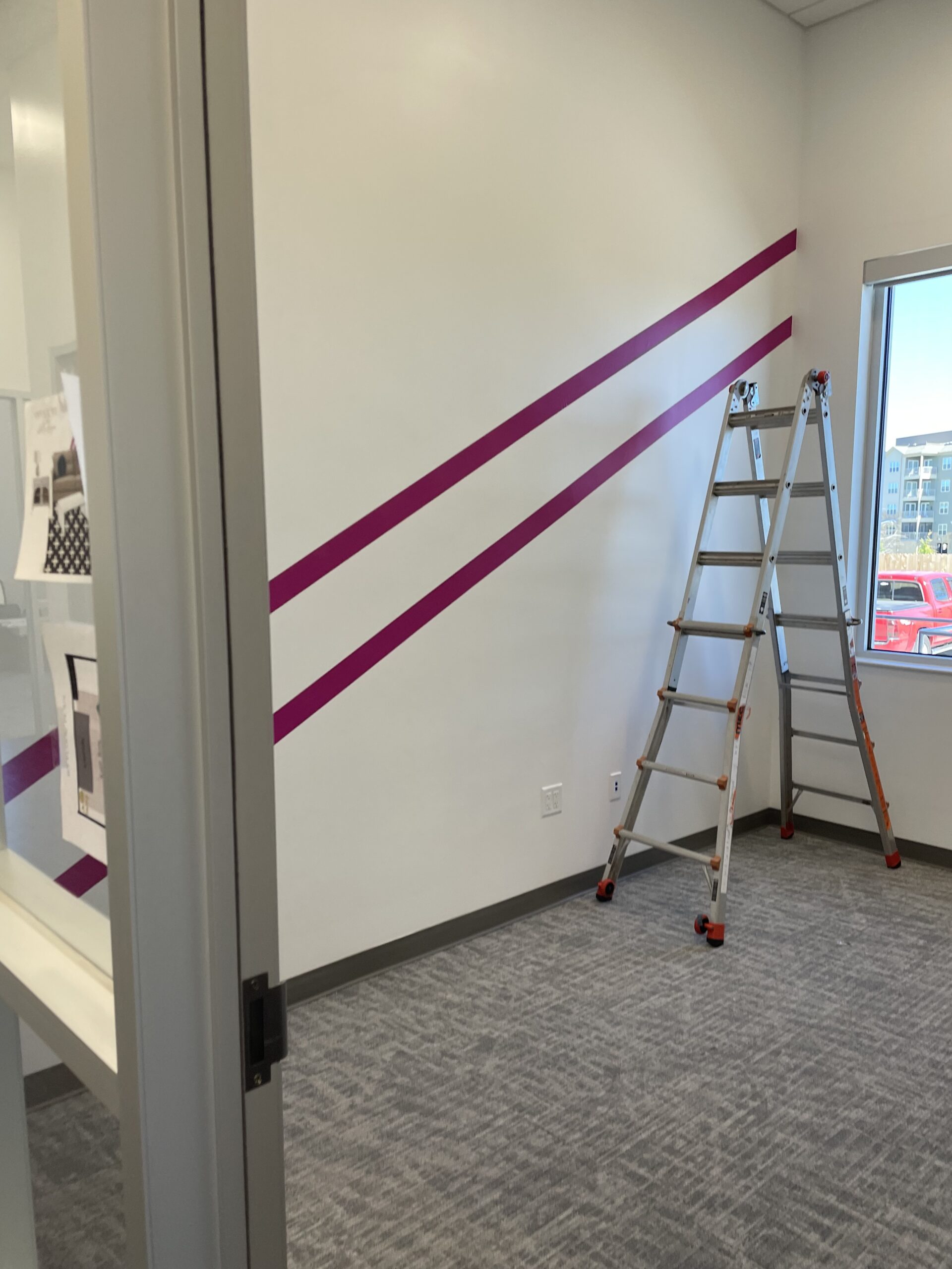
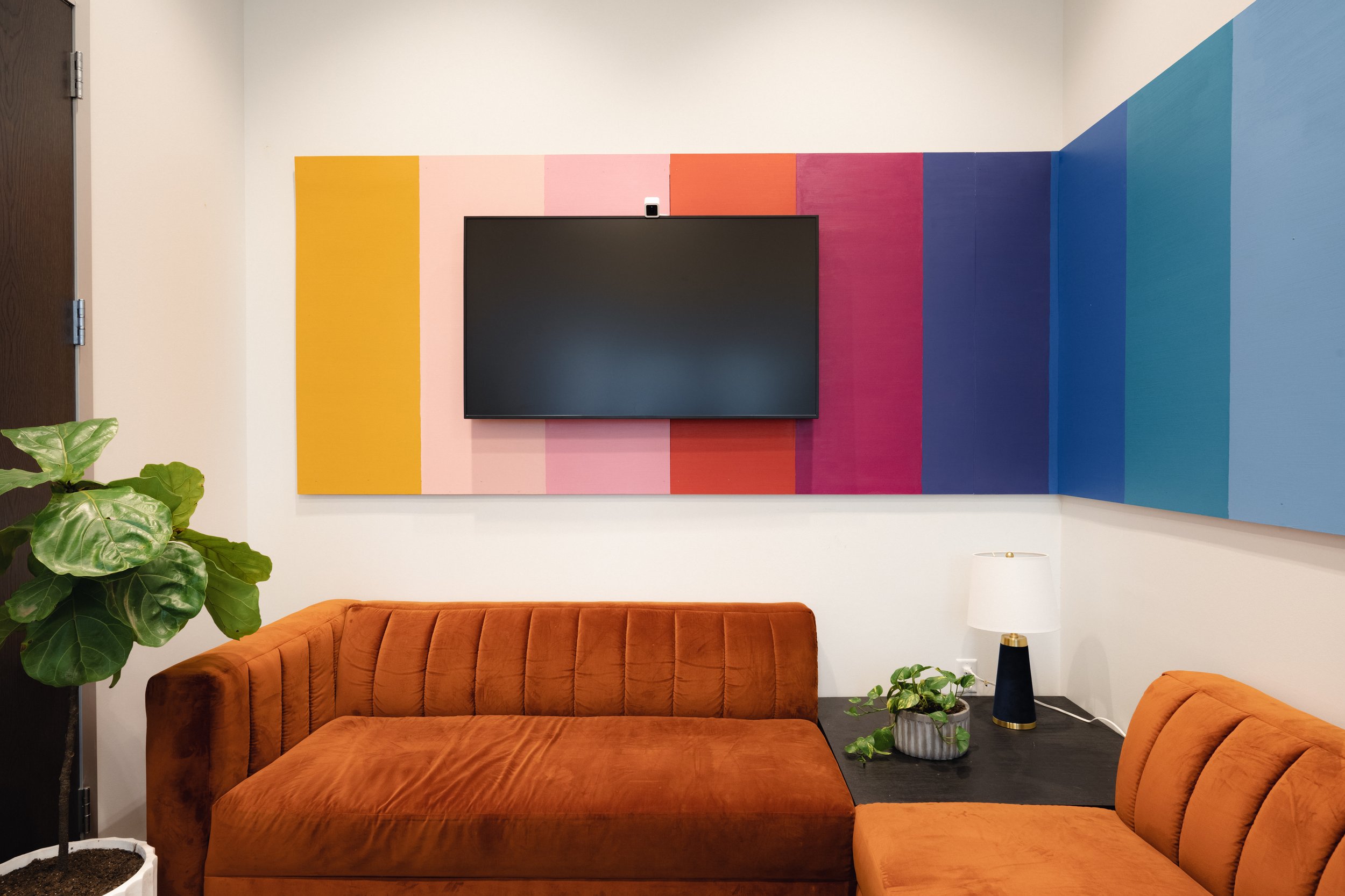
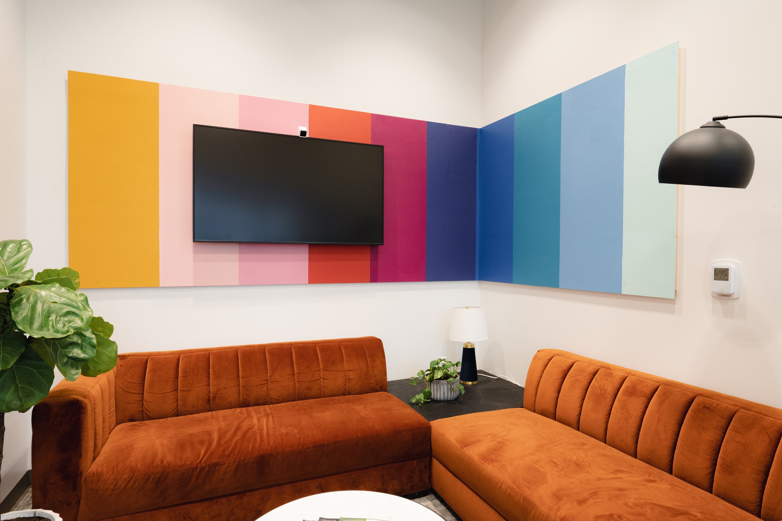
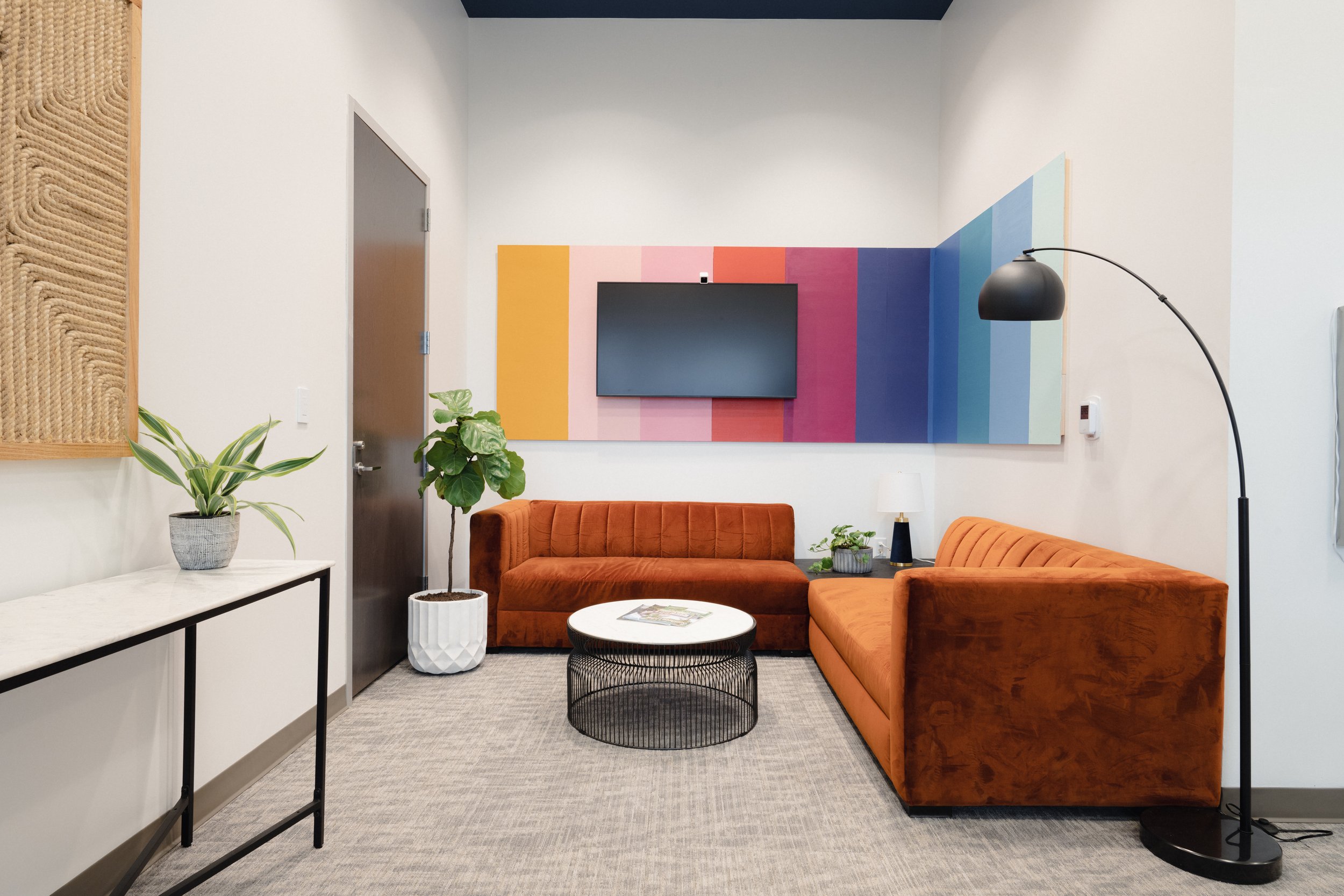
One of my favorite pieces are the peel and stick mural items, they added so much fun to the other wise white walled offices.
In the main waiting room we opted to do a DIY removable mural inspired by my friend at Banyan Bridges. While we would have loved to do a hand painted mural in the lobby, we found this solution perfect for space.
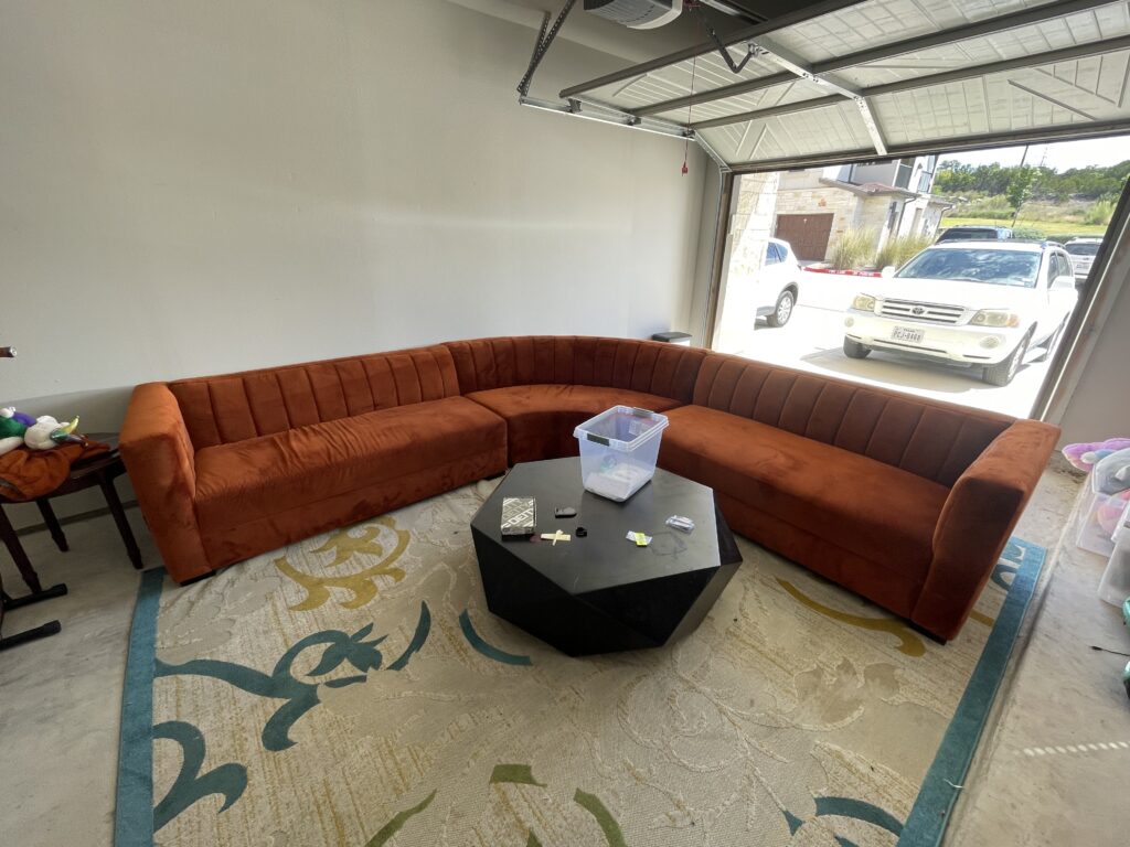
While we’re discussing the lobby, can we please talk about this super fun round sofa?! I found this in a nearby city on Facebook Marketplace for $800. We had to remove the corner piece and opted for a custom end table to fill the gap. Check out the Facebook listing photo, and how much better in looks in the right setting!
Shop the Space
How to Create Your Own Therapeutic Space
When designing and decorating a therapy office, I have a few recommendations that I have learned via trial and error over the years. Some tips have come from working directly with my brother who is an LPC and runs a practice of 17 clinicians, some from my experience as a client for 20-plus years in therapy, and others are pulled from design expertise. I would love to hear any recommendations you have as a clinician or patient as well, feel free to drop them in the comments for all to learn!
- Natural light is key- if you can select an office space with great natural light, start here. I know oftentimes small rental offices are located on the interior of buildings, but do whatever you can to select a space with windows and good natural light. This will benefit your own mental health as a clinician as well as make your client’s 50 minutes more enjoyable.
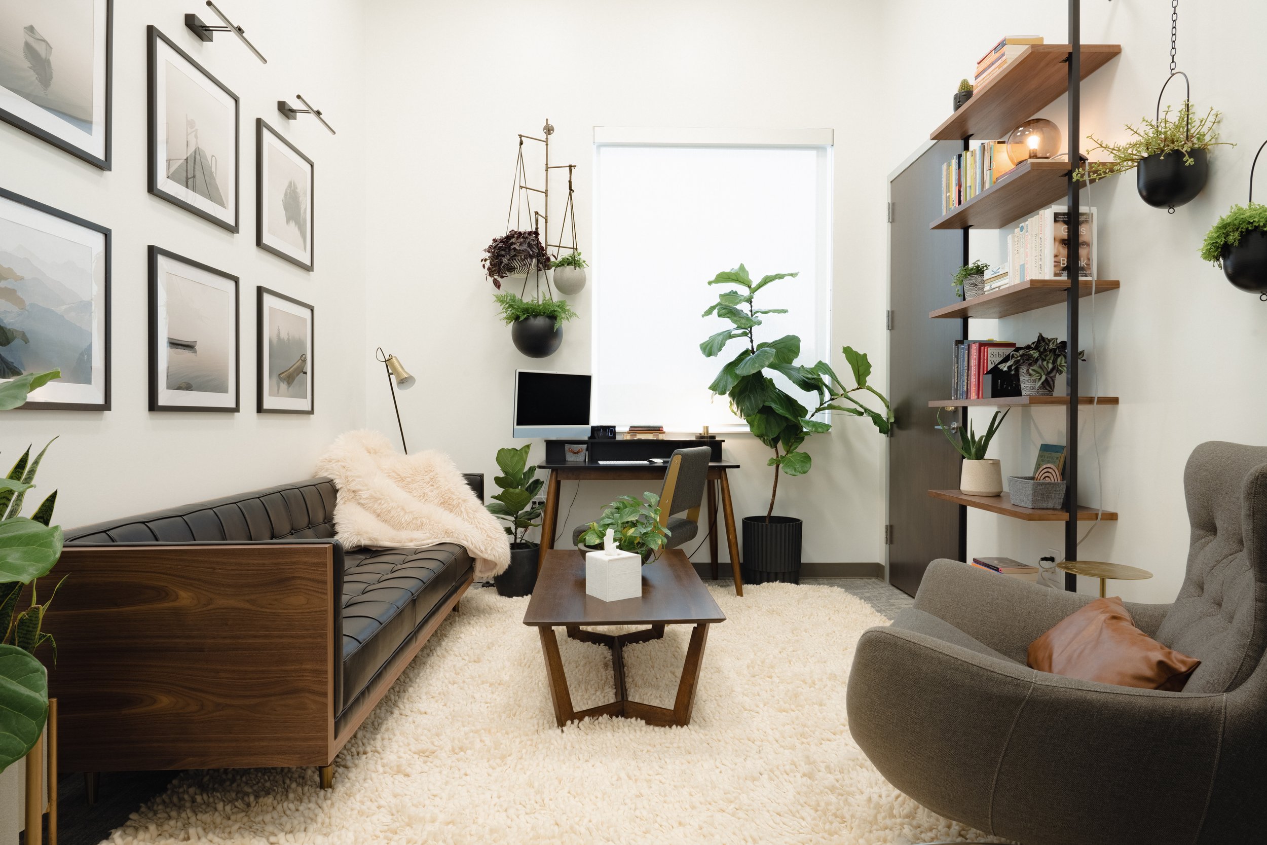
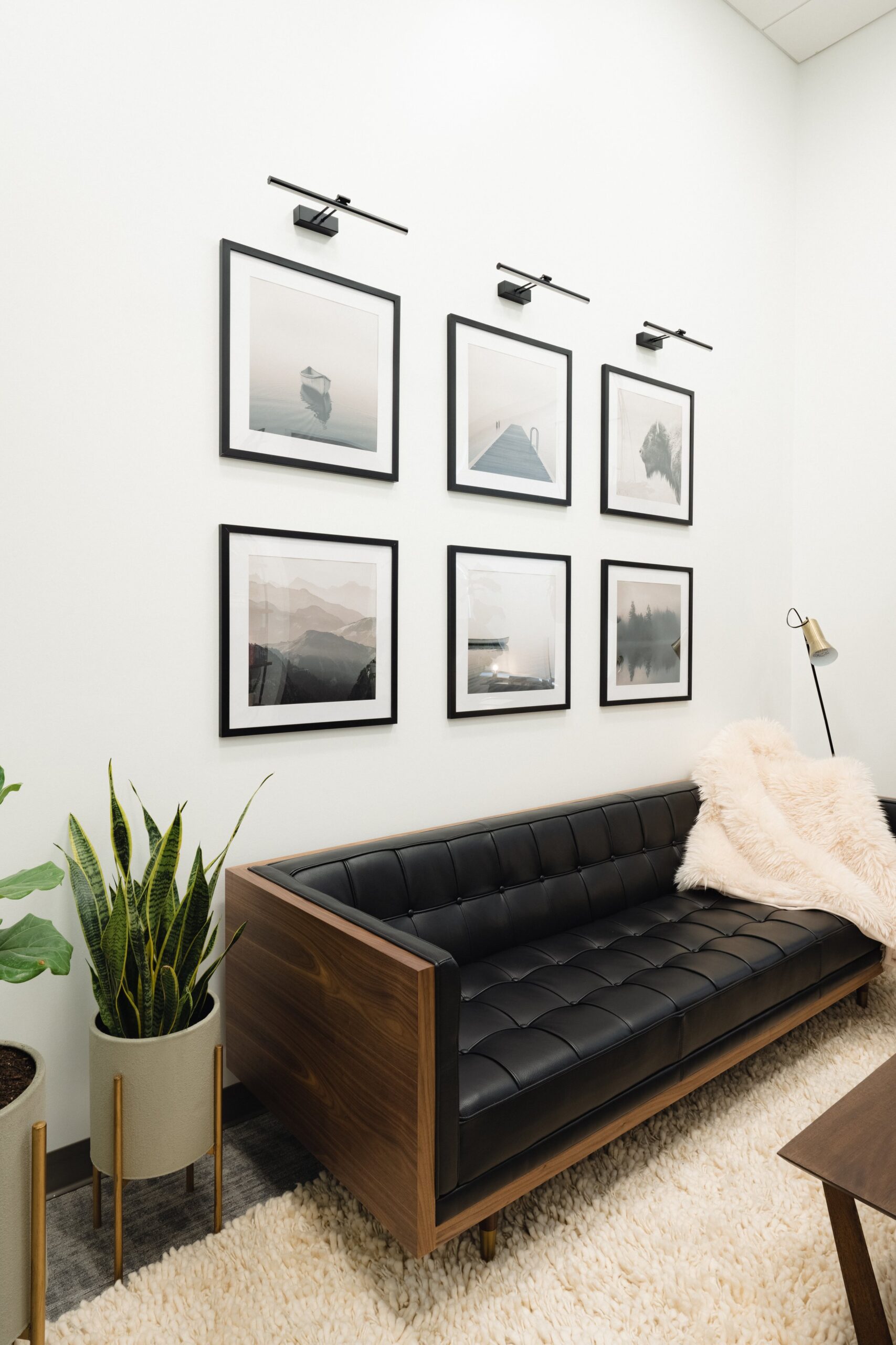
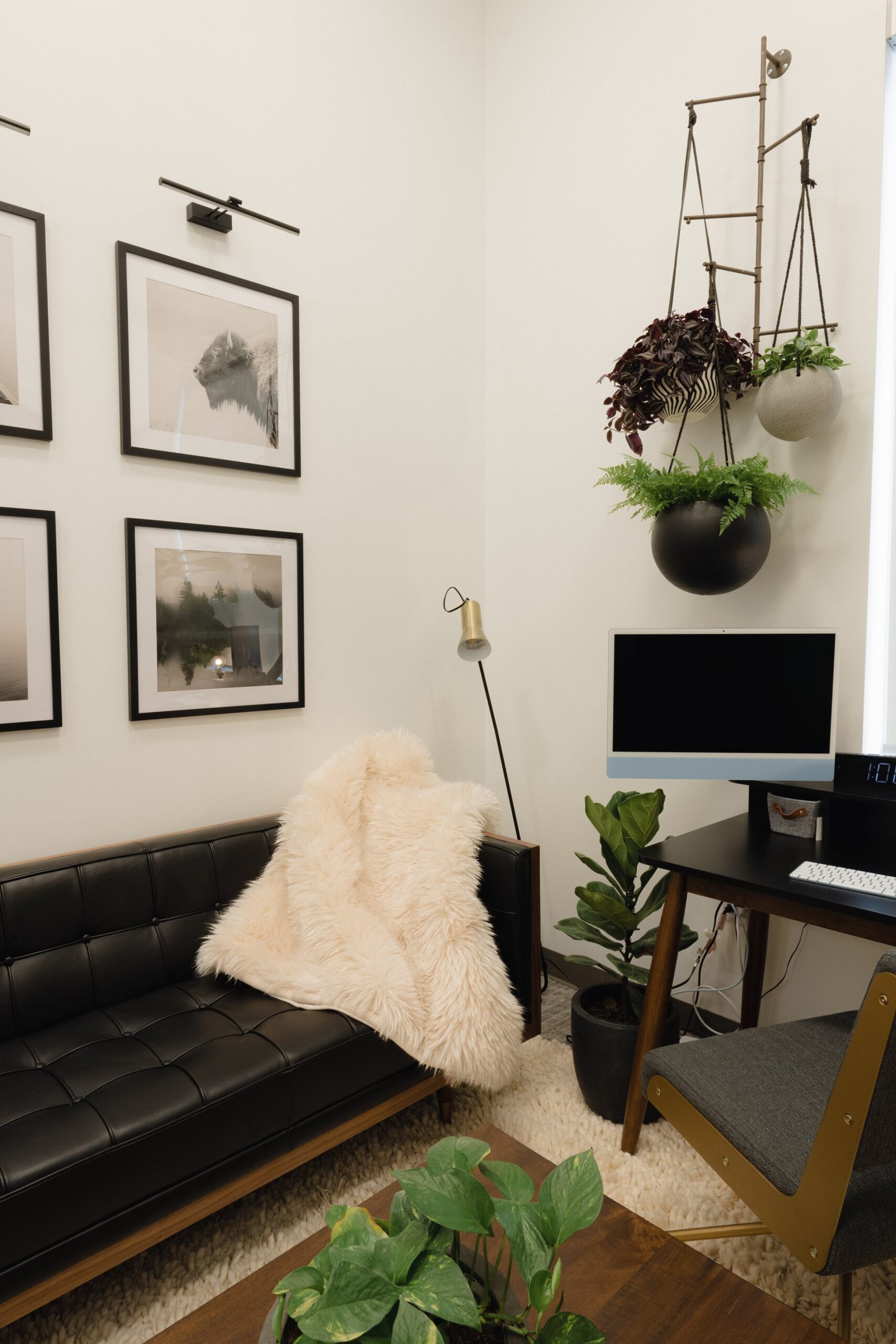
- Add Art that Represents You– While you may not have photos of family and friends in your space, your office must represent who you are as a person. In my brother’s office, we chose to do a modern block gallery wall with a PNW local photographer’s art of all PNW views and wildlife. My brother got his clinical degree in Seattle and the area is very important to him and the work he does. Now every day he sits in this chair and is reminded of how he got where he is today. Avoid art from places like Target, Hobby Lobby, etc. Etsy is a great place to find meaningful pieces by real people, and also try local artists or fairs.
- Live Plants– If you’re brave, try real plants in your office, they add so much life and natural color to any space. Don’t have a green thumb? See if someone in your office does and ask them if you can pay them a small fee monthly to help you take care of your new plant babies. I love the beauty of having natural life around me, even if the leaves are sad and droopy some days and need a little extra care, isn’t that a beautiful representation of the work that takes place in your practice?
- Layout– Never block the door with your therapist’s chair. Clients who suffer from PTSD often need to see a straight and easy path to the door, consider this when designing where furniture will go.
- Professionalism- Remember that this space represents you as a clinician, someone people are trusting and paying hundreds of dollars a week, think about how this space represents you just as your clothing does. Fill your bookshelf with literature that represents your philosophy, and add trinkets and memorabilia that show your personality.
- Add Layers– Textures such as curtains, rugs, pillows, and blankets add comfort and warmth to a space. Consider layering different textures for a client’s comfort.
- Sit in Their Seat– Sit on the “client’s sofa” to see how things look, feel, and appear from where they are. While you must enjoy what you see from your chair, make sure the client experience is visually appealing and not distracting as well. Be sure the seating is comfortable as well, not so cozy they sink and want to take a nap, but not so firm that it feels like a professional setting.
- Something to Look At– Make sure that from the client’s perspective, there is something to view. If the client is feeling stuck emotionally or just needs to check out visually for a moment, be sure there’s something to look at behind or beside you. This could be a bookshelf full of your favorite items, a window, or an interesting piece of art.
- No Distractions– If you have a window in your office, consider window coverings or shades that let in natural light, but that doesn’t cause distractions. If people are often walking past the window, be sure that clients can’t see that activity taking place. Also, be sure noise is drowned out by a sound machine outside your door.
- Furniture Selections– Be sure you consider your own work and what type of clients you tend to see. If you see mainly couples, be sure and have a large couch or better yet two separate couches for clients to sit on. With couples, there is often physical space needed. If you see mainly families, you might need two large couches to accommodate all family members, not having them all squeeze on one small sofa, especially when conflict evolves. If you see mainly children, consider having a small child-size table in the space.
The After
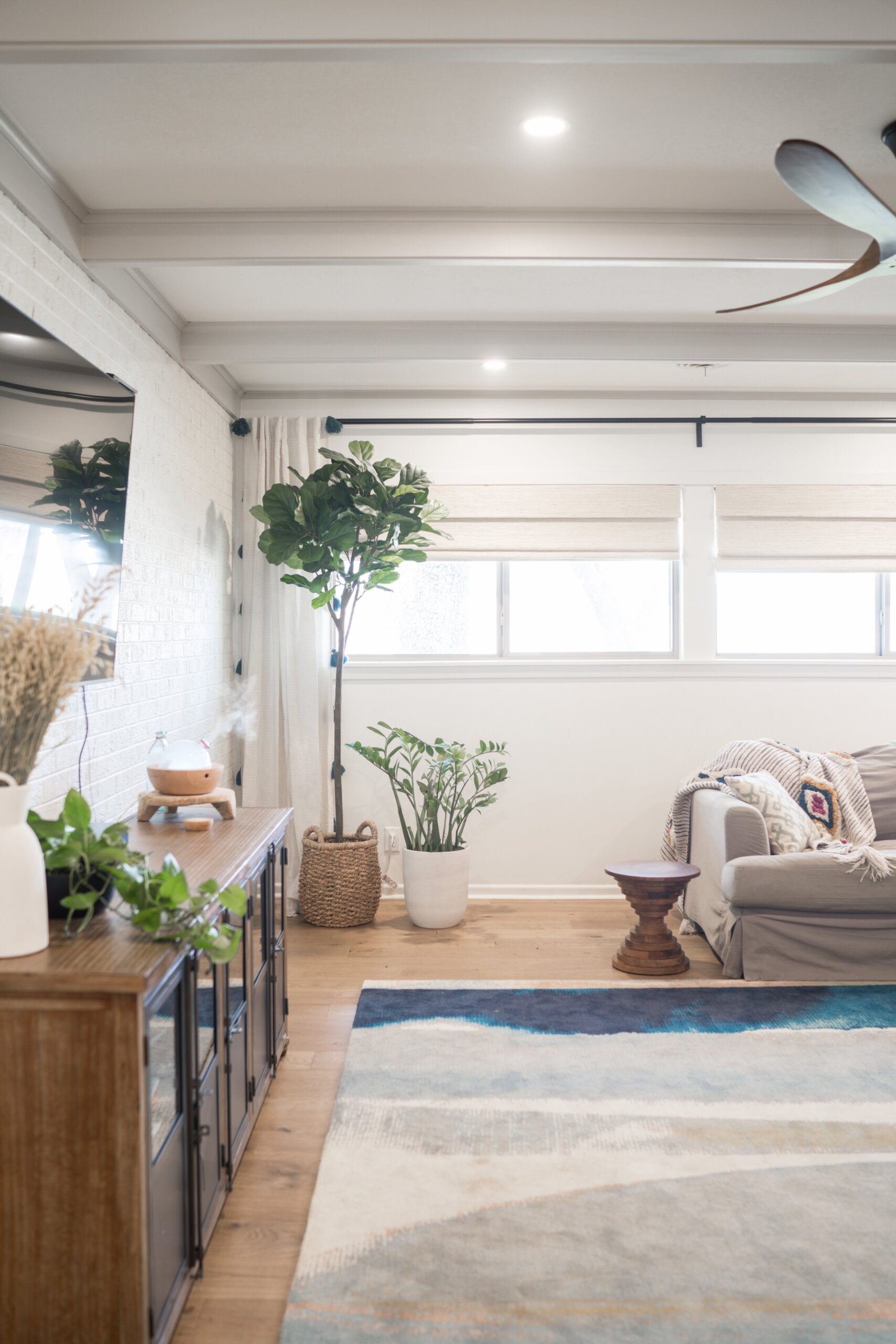
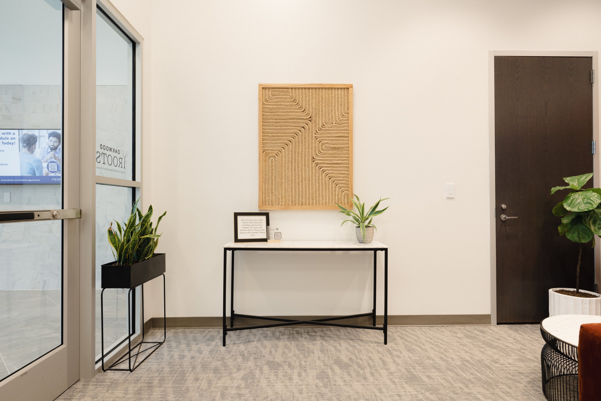
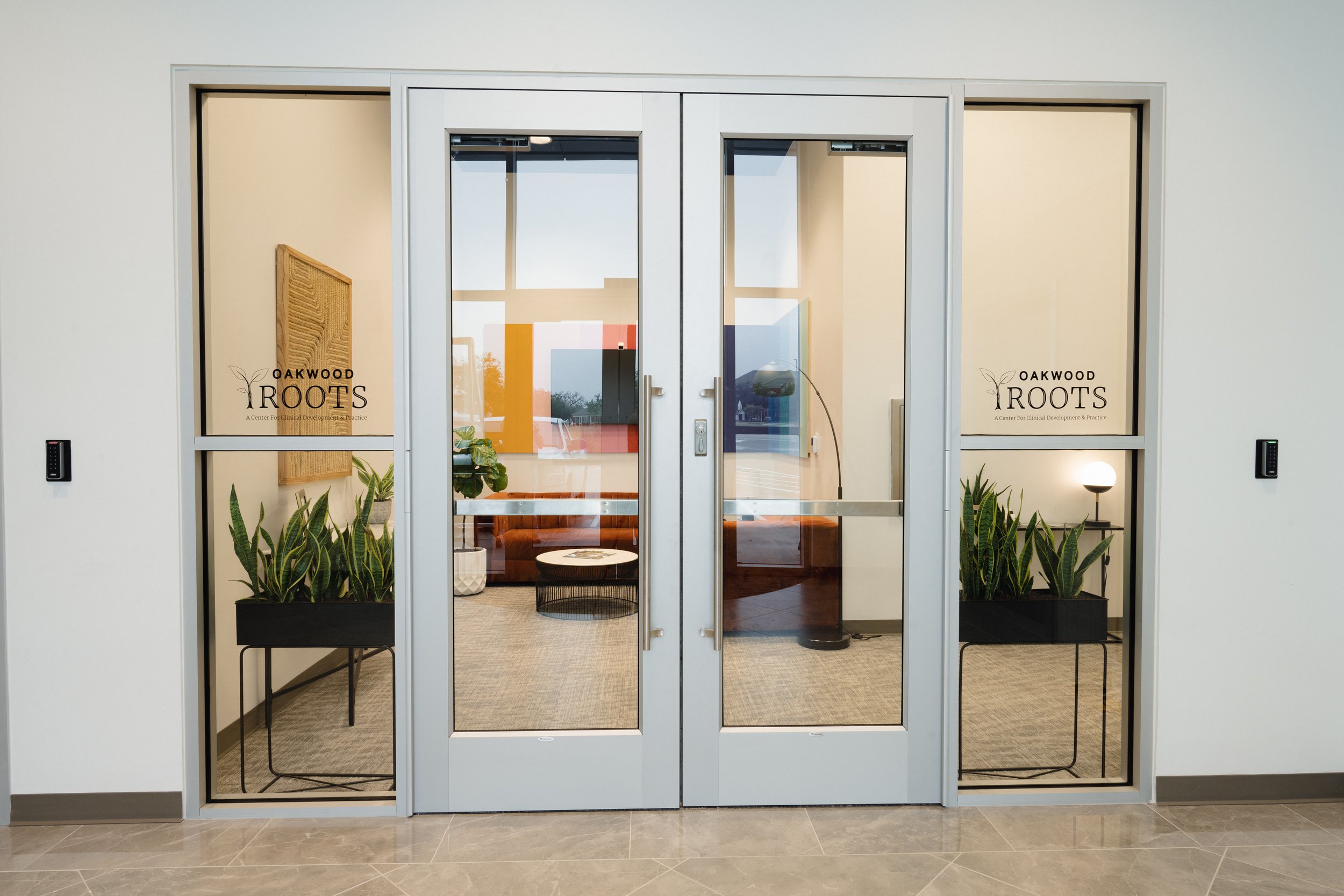
Natural light, pops of color, live plants, and soft accents characterize the entire office. Each room had different requirements but the result in each was a safe haven for anyone who visits.
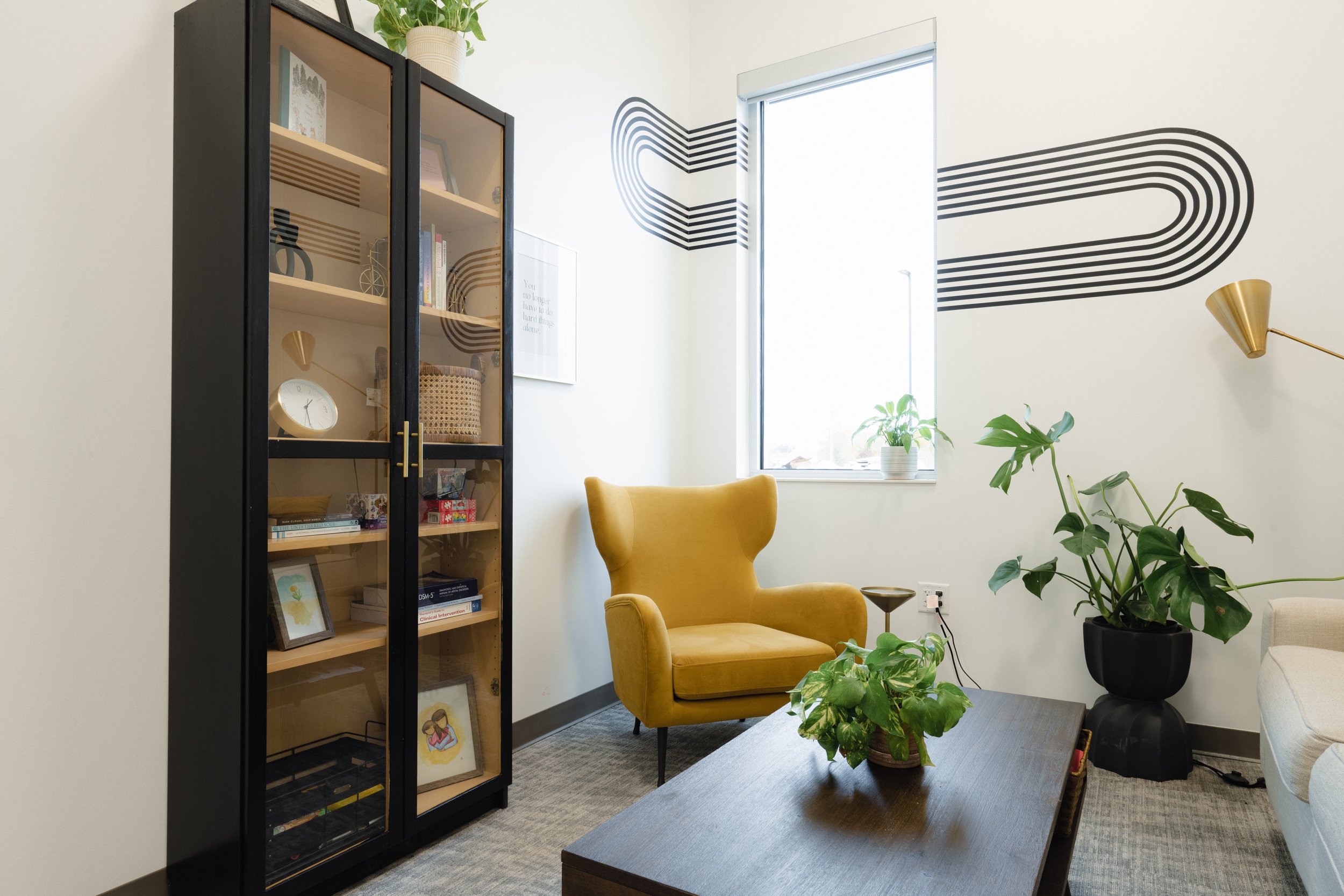
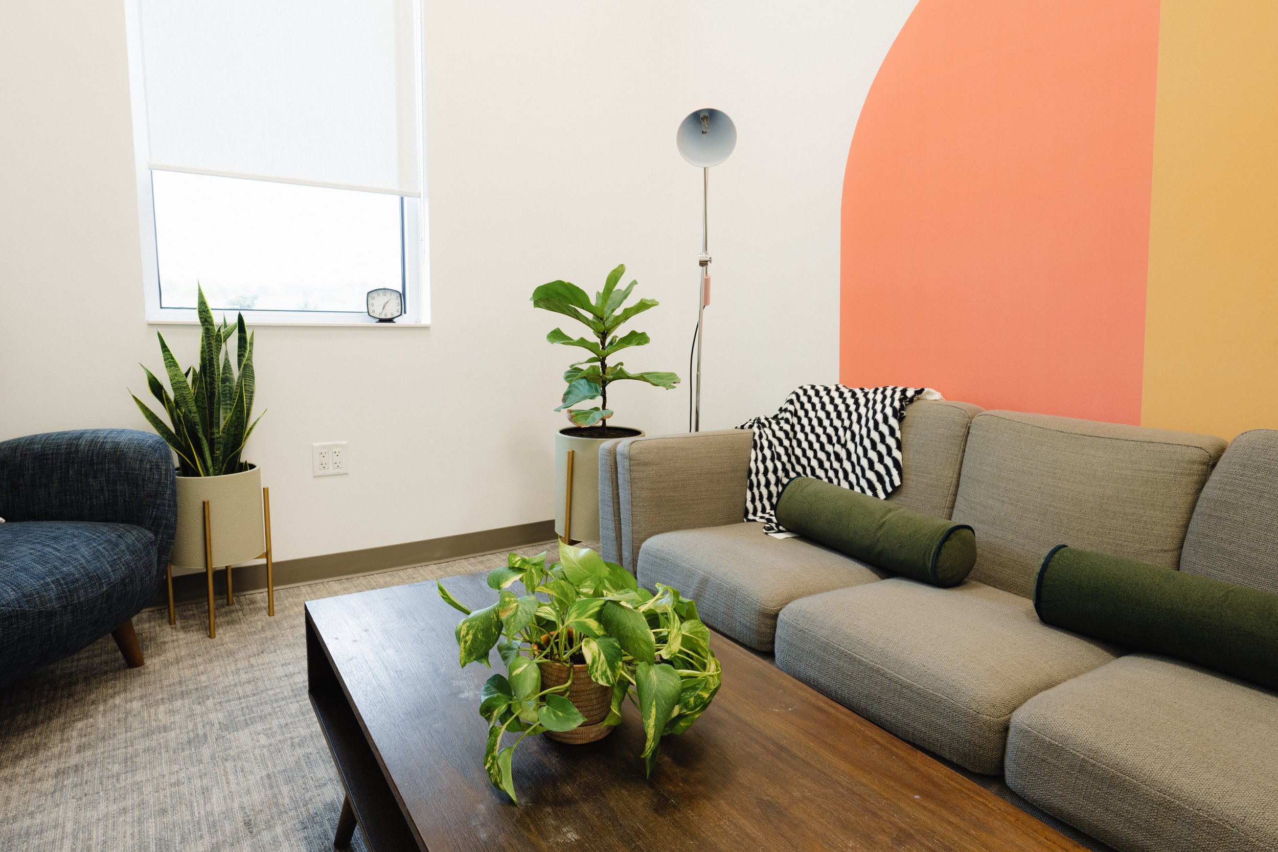
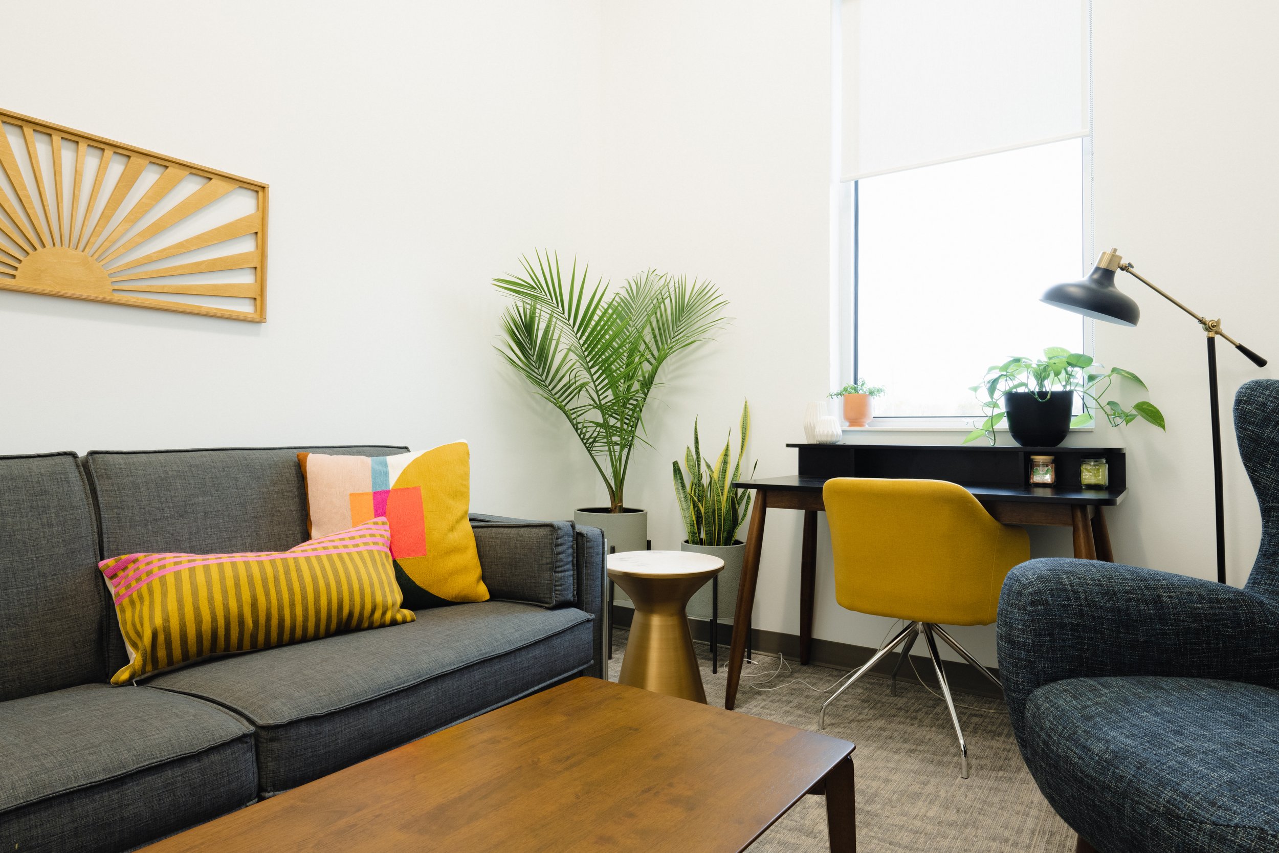
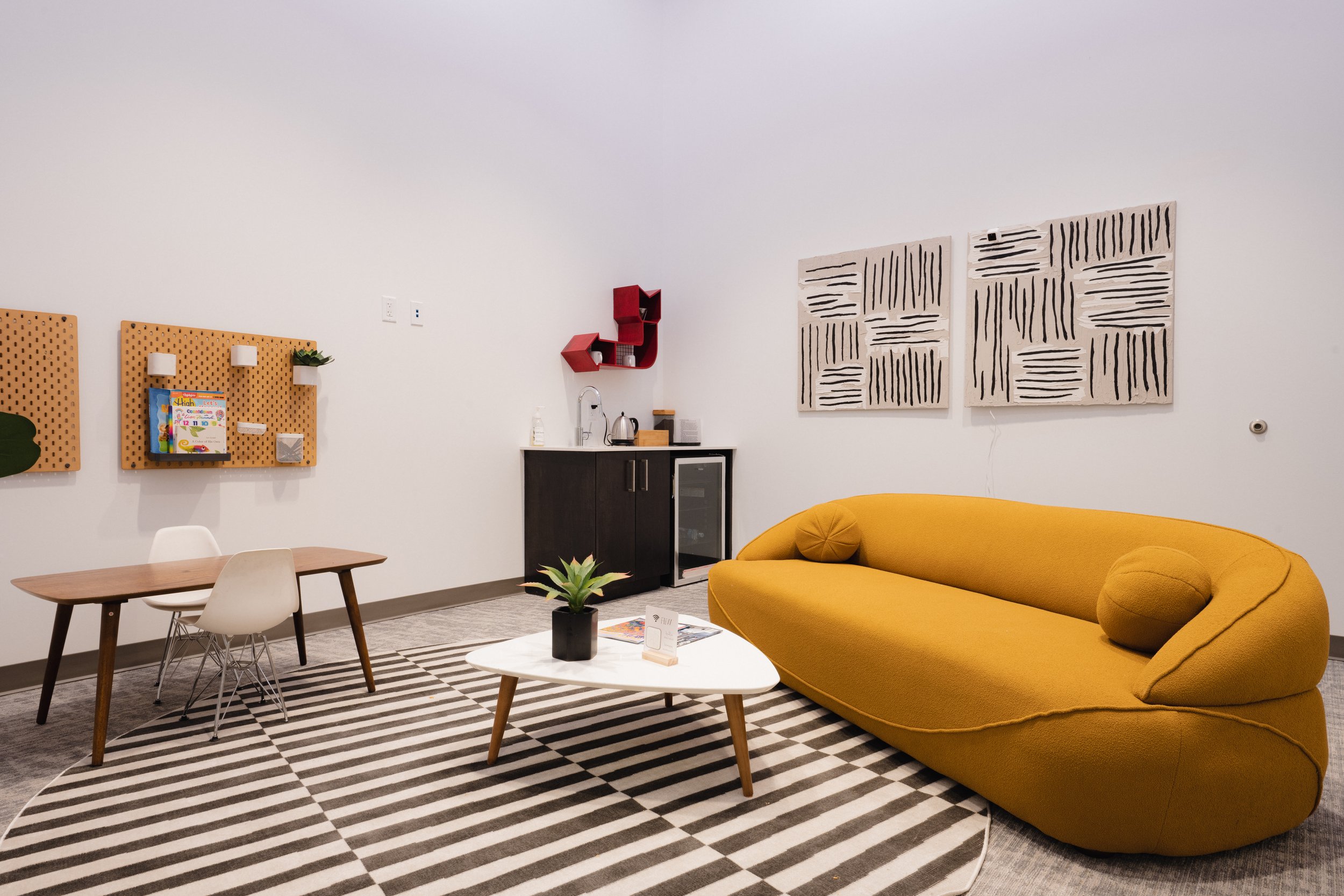



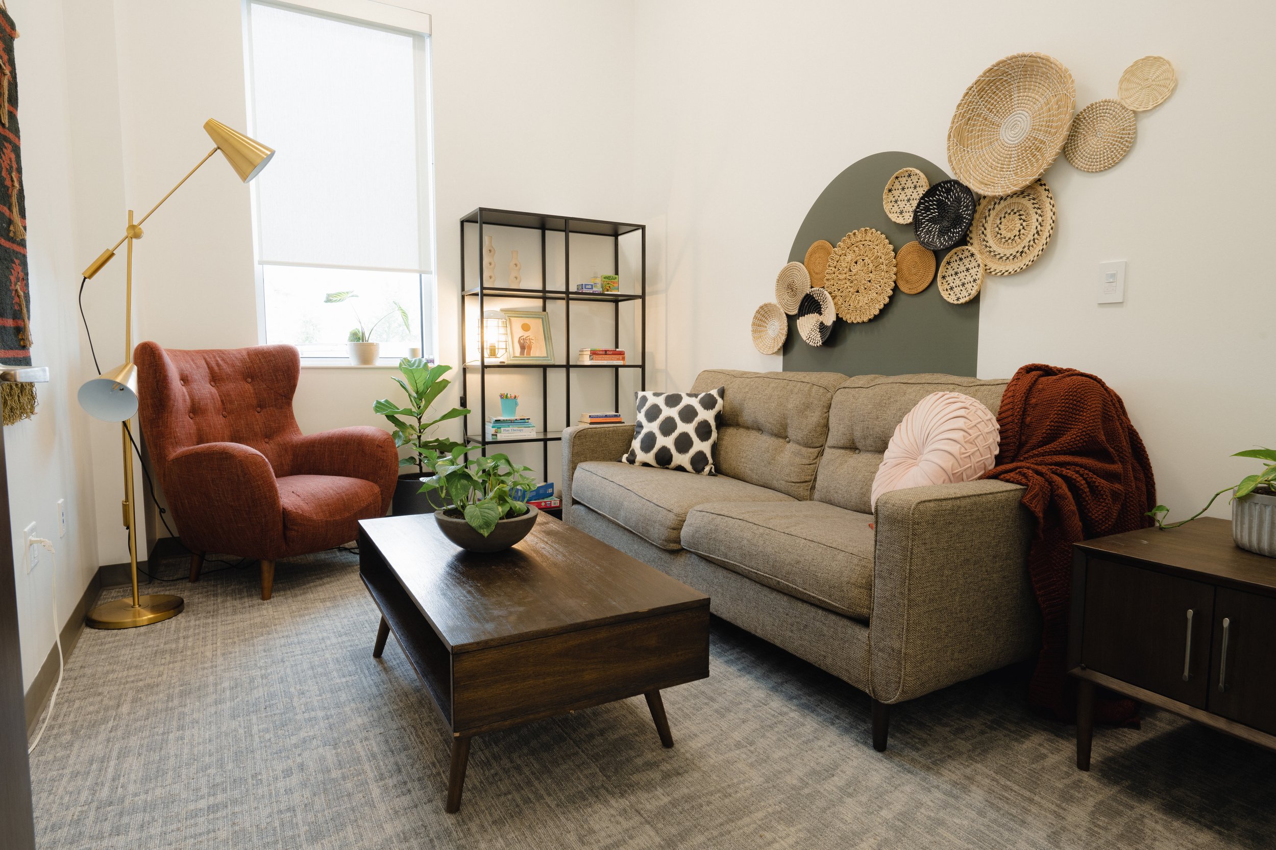


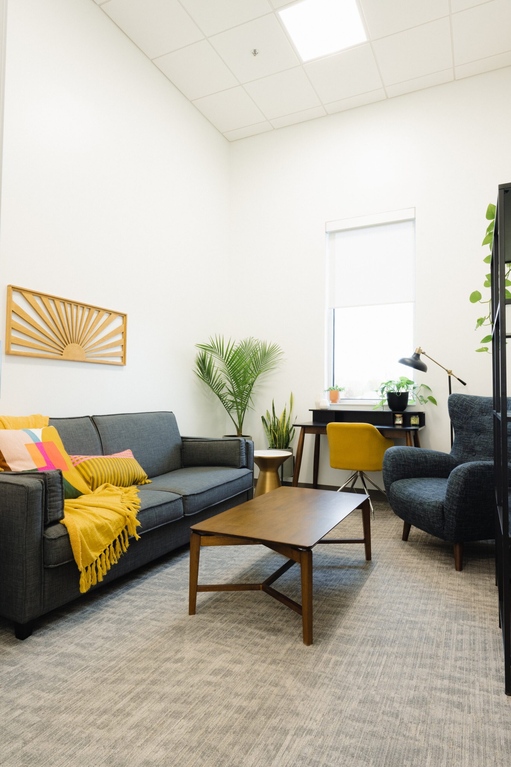


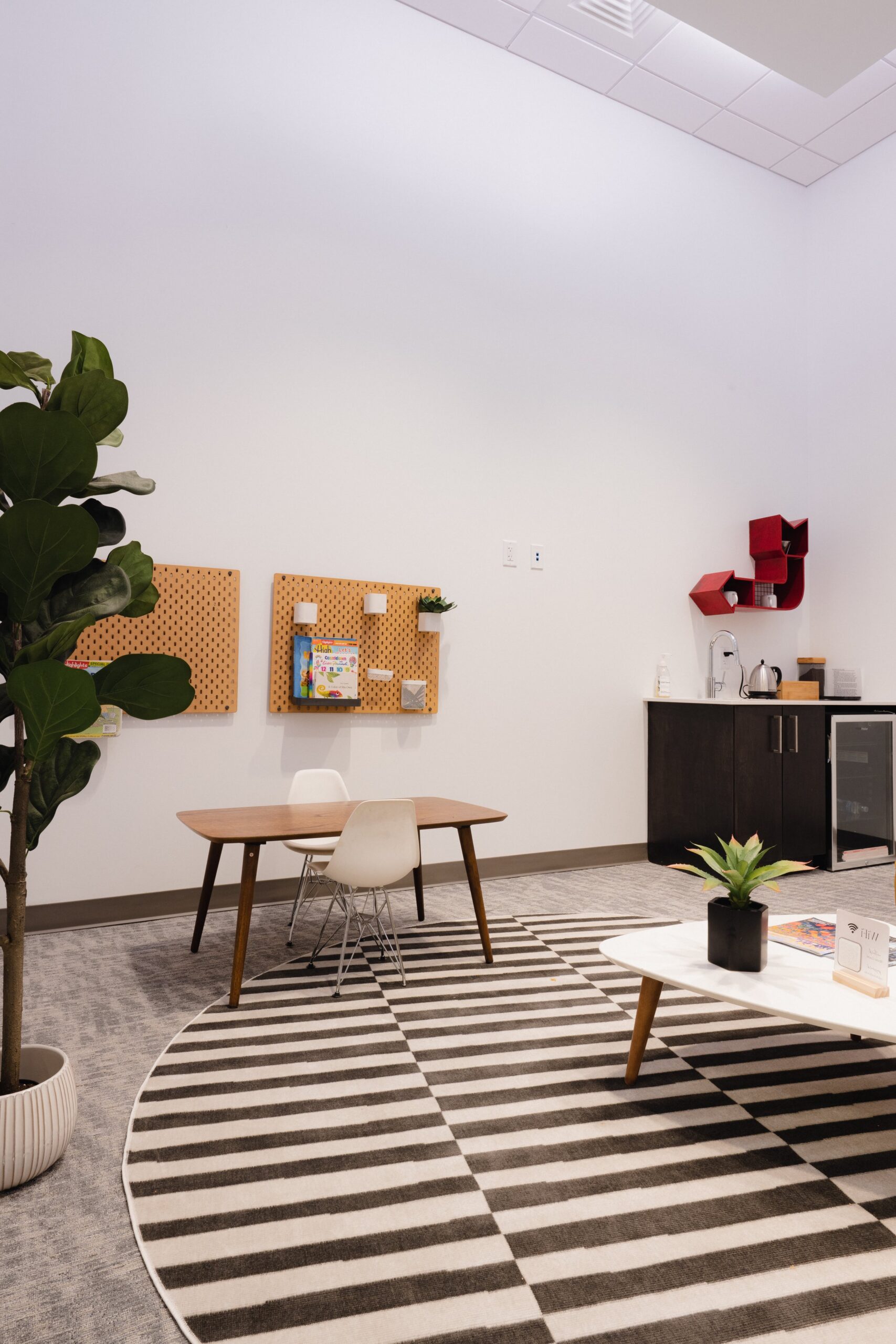
This was such a special project for me, and not only because it was my brother’s center. Cultivating life-giving spaces that promote health and healing is the core of what I do, and I was thrilled to do this on a larger scale in an established space of healing.
